Sunday, November 07, 2010

My recent labor of love, the Representational Seder Set is done and it is, if I may say so with the greatest of humility, wonderful! I know this is true because my husband, Avi, says so!

Rep Seder Set ALL 2

Here are the pieces and a bit of the thought behind them. The photo precedes the explanations for the pieces.:

Rep Seder Set charoset karpas

Charoset - Charoset symbolizes the mortar with which the Israelites bonded bricks when they were enslaved in Ancient Egypt. The word Charoset comes from the Hebrew word cheres which means clay. In the representational set, the charoset is held the bowl with bricks impressed on the outside.

Karpas There is a green, leafy vegetable (usually celery or parsley/lettuce) called karpas which reminds the participants that Passover corresponds with Spring and the harvest, which, in ancient times was a cause for celebration by itself. A more contemporary interpretation links karpas with the biblical description of the Hebrew slaves marking their doorposts at the time of the first Passover. A bunch of hyssop was to be dipped in the blood of the paschal lamb and used to strike the lintel and the doorposts (Exodus 12:22) so that the tenth plague (death of the firstborn) would not be visited upon their households. In the representational set, karpas is symbolized by a container mimicking the wood of the doors and the crossbeam of the lintel over that door.

Rep Seder Set maror chazeret
 
Maror and Chazeret The word maror comes from the Hebrew word mar, which means bitter. The seder plate usually contains two places for maror (bitter herbs), representing the bitterness of slavery. There are two places, called maror and chazeret, since the commandment (Numbers 9:11) to eat the paschal lamb "with unleavened bread and bitter herbs" uses the plural ("bitter herbs"). In the representational set, the maror and chazeret are linked by the use of a yoke and rope, symbolizing the years of slavery our people endured.

Rep Seder Set zeroah baytzah
 
Zeroa The zeroa (roasted shank bone) represents God's mighty arm when he freed the jews from slavery in Egypt. The zeroa is also symbolic of the Paschal lamb offered as the Passover sacrifice in the Jerusalem Temple. The platform altar is the representational piece in this set.

Baytzah The seder also uses a hard-boiled egg called a baytzah which represents the second offerings given at the temple in Jerusalem on Passover, Shavuot, and Sukkot. The roasted egg is symbolic of the festival sacrifice made in biblical times. On Passover, an additional sacrifice (the Paschal lamb) was offered as well. In the representational set, the nest holds the baytzah (egg).

Rep Seder Set Salt Water 2

Salt WaterDuring the course of the Seder, the karpas is dipped in salt water to represent tears. The set includes a tear-shaped bowl with colors mimicking the different depths of the Red Sea.

Friday, October 29, 2010

Avi and I are on a road trip through the Southwest (we’ve named it our Southwest Boogie and you can check it out at my other blog: Deep in the Heart… While we were waiting for our tour to begin, we came upon an incredible piece of pottery by an Acoma Pueblo indian named Marilyn Ray. It was several sculpted pieces creating a tableau – an Acoma grandfather storyteller and all the children who have come to hear him weave his tales.
The pieces alone are impressive in form and the personalities they capture with simple black and white contrasts. But once I began to look more closely, I realized the details are what makes this one of the most exceptional pieces of art I saw on our trip.
clay storyteller all 2
Notice the bolo the grandfather is wearing around his neck, the piece of pottery he’s holding and the small lizard on his shoe. Each child on the ground has a “pet”.
clay storyteller boy with ladybug clay storyteller children 1 clay storyteller closeup
Then I started to really begin studying the smaller details and noticed the ladybugs on each child as well as other small decorative details bringing the fabrics each person wears to life.
Clay storyteller grandpa 1
Her art, though difficult to get, is available at a couple of galleries. I think I know what we want for our anniversary gift this year!

Friday, October 22, 2010

I've just finished three teapots. Count them, THREE! Why three? I received a commission for a teapot to match a pair of Saba and Savta (grandpa and grandma) mugs. We agreed on a 3-4 cup capacity. While throwing I ended up with the Three Bears.

The first teapot was way too big. But the owner of my studio loved the size and asked if I could finish it for her as a gift. So I threw a lid and a spout and pulled a handle. Then I took navy blue underglaze (to match her dishes) and used it to make a wide band of color on the body. Finally, I carved an entire flock of cranes around the pot, similar to this mug.


This time I didn't add the effect of the water, since the background will be a deeper blue.


The second teapot was a bit smaller, but still too big for the commission piece. I finished it with a white underglaze band and added pink, purple, and light blue round sponge-stamped dots. It came out much nicer than I anticipated and it will be sold at a fundraiser for breast cancer research in November.

 Third time was the charm. The pot was the perfect size and it's been decorated with a Moorish Jewish star pattern.

I was going to have it repeat around the pot, but decided it would be too busy. I wound up putting one centered under the handle and one on each side. It gave the pot an understated Jewish theme without screaming it in your face as you pour your tea or coffee.


I keep forgetting my camera, so I don't have interim shots of the pots. But I'm hoping they'll be bisque fired by the time I get back from my 10 day trip (driving through the Southwest with my hubby). Then a quick coat of clear glaze and into the glaze fire for completion!


Thursday, September 30, 2010

As we approach the end of this year's High Holiday cycle with the celebration of Shemini Atzeret and Simchas Torah, I've turned my creative eye to Passover. I've recently sold the Seder Set in my shop, leaving an open spot for a new design.

I've always liked the deconstructed Seder Sets and have decided to turn in that direction and create a Representational Seder Set, with pieces designed to inspire discussion of the symbolic foods on the Passover table.

I began by throwing a tall, straight sided cylinder, which I cut into 4 sections of equal size. This avoided the uncertainty of getting a matching set by throwing each piece separately. The  bottoms of these would be cut from a slab. But a couple of them would be treated to texturing on a couple of different texture boards before their bottoms were added.

The Charoset dish, representing the mortar with which our ancestors built structures as slaves in ancient Egypt, is textured with a brick pattern. The other has a wood pattern for the Karpas, or the greens, which has several different interpretive symbols. The one I have chosen is a lesser known one, it's representation as the plant material used to mark the doorposts of each Jewish home to protect its inhabitants from the final plague -- the killing of the firstborn.

The easiest way to texture the exteriors of these open cylinders was to roll them over texture boards using a rolling pin on their inside. The bricks were easy. However, for the wood, I cut the top of one of the sections off so I could roll the bottom one way and the top portion the other, then reattaching the pieces once the textures had been rolled on. This gives the appearance of a door with the lintel on top.

The Baytzah (egg) just has a slab base, with a surrounding nest created by pressing clay through a garlic press and attaching sections of it with a bit of slip. The Zeroah (bone) will sit on a slab "altar" with curved "legs" to elevate it.

The greatest representational challenge was the Maror and Chazeret, both bitter herbs -- two types, since the text speaks of bitter herbS, After much thinking and even more discussion, I decided to link the two cylinders on a single base, adding a yoke to the front of one. Once the piece has been fired, I'll loop a small rope from the yoke, around the two bowls.

I'll also be making a bowl for the salt water in the shape of a tear. However, I need to first finish up the underglazing of the pieces that have already been made.

I haven't taken photos yet. But, rest assured, they'll be forthcoming soon.

Friday, August 13, 2010

Well, true to my predictions, I've become underglaze crazy. In fact, I'm trying to switch from my Mason Stains in slip to Amaco Velvet Underglazes for most of my work calling for that type of application. But this switch has not been without its issues.

For one thing, I still get some fading with many of the colors. I've now printed out a color variations chart for them, indicating what they will do  at cone 5 glazed and unglazed (and cone 10, though I don't think I'll see cone 10 for quite a while).

Another issue I'm having is watching the colors fade away under my clear glaze overcoat. I think I'm going to try thinning the glaze a bit before applying it. The thickness creates a milkiness, obscuring the color beneath.

Finally, I've had the underglaze run under the clear glaze on a vertical surface. This is NOT a good thing, considering most of my work is vertical (mugs). Again, I think it's a function of the thickness of the applied clear glaze. I've applied a thinner coat on my latest mugs. We'll see what happens.

Meanwhile, let me share one of my successes -- since not everything is doom and gloom. The following is an Apples and Honey set for the Jewish New Year (Rosh Hashana), coming up the evening of Sept. 8, 2010. We eat apples dipped in honey to symbolize our wish for a sweet year.

Thursday, March 18, 2010

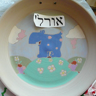
The baby plate in my previous tutorial is finished.


It was bisque fired to cone 06. Then I brushed on a thin coat of clear glaze. I brushed on the glaze rather than dipping the plate in it because there are very few true clear glazes. Most of them have some sort of color  where they are a bit thicker. By brushing it on I have better control over how thickly I want the glaze applied over my underglaze design.  The plate was then fired to cone 6.

Unfortunately, the final firing caused some of my underglazes to fade out a bit more than I would have liked, which is why I'm currently running a test of all the Amaco Velvet Underglazes in my current collection:


Of course, this is something I should have done before. But we all get lazy once in a while. The lesson is, when we're lazy we wind up paying the price with our final product.

Since one of the fade-outs was on the baby's name, I ran out and bought a tube of Pebeo Vitria 160. This is a type of very low fire "glaze" you can put on glass, metal, or glazed ceramics. You let it cure for 24 hours and then bake in an oven at 300 degrees F (160C) for 40 minutes. I used a dimensional black, which brought out the name quite nicely. However, I don't think I would use this on anything other than a decorative piece, since there's no indication of whether or not this substance is food safe.

We gifted the plate last night. The photo will go into my etsy shop as an example of a custom baby plate, along with three more of David's drawings.

All in all, I'm pleased with the process. I've even used a few colors in a vase I just made, creating a sunset background to a flock of sgraffitoed  cranes. Do I sense a new direction for more of my work? We'll see!

Sunday, February 21, 2010

I've been promising a demo and I needed to remake the baby gift that blew up in the kiln, so I took the opportunity to combine the two. So, these are the deep dark secrets of my upcoming custom baby plate series using the wonderful art of my good friend David Kaminsky.

I begin with a plate that has dried to almost leather, meaning it's no longer tacky to the touch, but still has a decent amount of give in its softness.

I print out a scanned copy of the art I'm using, sizing it to the area I need to cover. Then, because making an impression of this size using the paper leaves remnants of said paper on the damp clay, I trace the pattern onto a piece of plastic wrap using a permanent marker. I then use this to gently incise the pattern onto my plate.


Once the pattern is completely incised, I grab my Amaco Velvet Underglazes and consider my color options.


Then I just start painting. I use a few different brushes, all natural fiber. 

I don't worry too much about the details. These can be cleaned up later when the underglazes have dried, but the clay is still moist. For the most intense color I use three coats of each color. Because I'm anal, I only work with one color at a time, allowing each coat to dry in between. The clay tends to absorb a lot of the moisture, so three coats usually doesn't take very long.

For the sky background, because I don't want the plate to be overpowering, I use a "wash" coat of the underglaze rather than the intensity three coats would offer. This is done with a quick single coat.

Then it's time to add the name. I know -- I could have just done it on the same plastic I used for the main picture. But the letters are more delicate and I prefer using the heavier quality of paper for this and, since the paper doesn't sit on the clay for long when incising the name, I don't get any paper fibers stuck to the clay.


Finally, I fill in the letters for the name, use my incising tool to accent the definition lines, clean up any small smudges, and the initial work on the baby plate is done. It will go in for a bisque firing, which will bring out the stronger shades of the underglaze though, unlike regular glaze, they won't change too much from what you see here.


To be continued.........

Monday, February 15, 2010

I guess two out of three isn't bad.

I made three plates. One was a 12" (ok, so it only came to 11" after bisque) commission. Thank goodness, that seems to have made it through the bisque firing. Another was a prototype of a customized baby name plate I'd like to begin offering in my etsy shop. I even got some underglazes specifically for the purpose. The last one was another Hebrew baby name plate that is supposed to be a gift for my husband's partner, whose wife just gave birth to their fourth child. Guess which one of the two baby plates blew out the center in the kiln?

I guess it was just fired before its time and had one of those nasty steam-trapping air bubbles in its base. ARGH!

But, on a lighter note, I'd like to share the following photo. Unfortunately, I'm not sure of its original source or I'd give credit. But doesn't it just express how you feel as a potter?

Sunday, February 07, 2010

It's been a slow week in my etsy shop, but a busy one in the studio. I threw several mugs of different ilks: Hebrew, birding, and a La Taza mug for a local coffee shop that sells them. I threw a tile to fire a large commission plate on (so it doesn't drag on the kiln shelf as it shrinks in firing). And I finished underglazing two baby name plates using my friend David's drawings.

One of the name plates bears the name "Yossi". Nobody I know, but certainly a very popular name among Israelis and, hopefully, some Americans. But it's simply a prototype showing a sample of my work for future custom orders.

The other plate sits under plastic waiting for us to discover the name of our friends' new baby daughter. Jewish superstitious custom is not to reveal the name of a new baby until he or she has been officially "named" in temple. We're assuming she was named this weekend; so I'm hoping to get her name on this plate, which will be our baby gift, this week.

I also got my finished Panoramic Crane mug out of the final glaze firing. It's my donation to San Antonio's Empty Bowls fundraiser silent auction. I think it's gorgeous!


We'll see if the people attending think the same.

Wednesday, January 27, 2010

I thought I'd take a few minutes to explain why I decided to go with colored underglazes rather than majolica glazes.

The first reason is movement. In my experience, underglazes and colored slips (both contain clay) tend to adhere better to surfaces. I've had no experiences with it running under a final coat of clear glaze. This gives me sharper lines in my carving.

Secondly, I want strong, intense colors in my upcoming prototypes and projects. Something like this by Sharon Bloom:


The following is a wonderful majolica piece by Judy B. Freeman. As opposed to underglazes, majolica is glaze -- much more closely related to glass than underglaze. As such, it has a softer, more watercolory feel to the coloration, which definitely works on this piece, but which I don't think I could pull off with the designs I have from David:


Of course, as this life tends to work, I'm sure there will come a time when I decide I've had enough of underglazes and get brave enough to start working in the world of majolica.

Yesterday I threw a couple of plates to work on. I'm hoping to get them trimmed out today. Then, when my anticipated delivery of underglazes comes tomorrow, I can get to work on them next week.

Tuesday, January 26, 2010

I'm moving into a new world and that world contains Amaco Velvet Underglazes.

"Why?" you may ask.

I recently completed a weddding kiddush cup commission. The customer wanted it in Northwestern University purple, which is a rather intense color -- one I knew I couldn't achieve using Mason stains in slip. So, I broke down, asked around, and came up with Amaco's Amethyst underglaze.

The kiddush cup came out wonderfully!


Tied in with that was the receipt of new drawings by my artist friend David. Several of them are adorable imaginary animals that would be absolutely perfect on a baby name plate (in Hebrew, of course). But they just wouldn't look right carved through a single color of slip, which has been my hallmark technique up 'til now.

So, when I put the two events together, it helps make up my mind to try using strong pastel underglazes on my soon-to-be-made baby name plates. Since shipping info shows my underglazes are due to come on the 28th, I think I'll throw a couple of plates today so they're trimmed and ready to decorate early next week.

Meanwhile, I'm also working on a rather large plate that's a commission piece, with the tree of life around the rim and encroaching on the center, with the words Tikkun Olam in bark textured sprigs in the center of the piece. The customer wants lots of color on the plate -- but I think I'll leave the various colors on the individual letters, add brown on the tree, and I'll decide on the background once it's been bisque fired and I can get a better feel for what the finished plate might look like.